Restaurant Website Redesign Leads to 30% Increase in Online Orders
Project Overview
In this comprehensive UX case study, we delve into the redesign of a restaurant website. This project spans over two months and aims to address the core problem of enhancing the online user experience for restaurant patrons. The ultimate goal is to create an intuitive, efficient, and enjoyable website that will significantly improve user engagement and conversion rates.
The Product
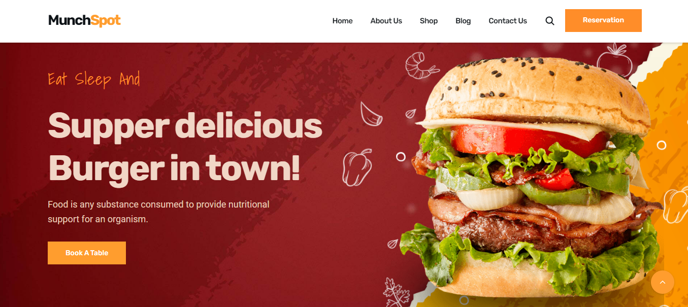
The restaurant website serves as a digital representation of the establishment. It provides essential information about the restaurant, including the menu, opening hours, contact details, and reservations. The website also allows users to explore the restaurant's ambiance, view images, and read customer reviews.
Project Duration
The project is expected to be completed in two months.
The Problem
The core problem the users are encountering is a website with a confusing layout and poor mobile responsiveness. Users find it challenging to access information quickly, make reservations, or browse the menu. This results in a high bounce rate and reduced online orders.
The Goal
By conducting this case study, we aim to achieve the following objectives:
- Improve user engagement and retention on the website.
- Increase the number of online reservations.
- Enhance the mobile responsiveness of the website.
- Create a visually appealing and user-friendly interface.
My Role
I am the UX Designer responsible for this project.
Responsibility
My responsibilities include:
- Conducting user research.
- Analyzing user behavior and feedback.
- Creating design solutions that prioritize user needs.
- Enhancing website usability, especially on mobile devices.
Understanding of the User
User Research
To understand the users, we will employ various UX metrics, including:
- User surveys to gather feedback on pain points.
- Heatmaps to analyze user interactions with the current website.
- A/B testing to assess the effectiveness of design changes.
- Competitor analysis to identify best practices in the industry.
User Summary
The typical user of this restaurant website is someone who is looking for a dining experience. They may want to check the menu, make a reservation, or view photos of the restaurant's ambiance. Users are often using mobile devices, and they expect a seamless, visually appealing, and informative experience.
Pain Point
The primary pain point for users is the difficulty in navigating the website. This includes slow loading times, unclear menu structures, and a lack of mobile responsiveness. Users become frustrated when they cannot find the information they need swiftly.
Personas
To better understand our users, we have created two personas:
-
Business Professional Beth
- Age: 32
- Occupation: Marketing Manager
- Goal: Quick access to the menu and online reservation for a business dinner.
- Frustration: Slow website and unclear navigation.
-
Family-Oriented Sam
- Age: 38
- Occupation: Teacher
- Goal: Checking the menu and ambiance before booking a family dinner.
- Frustration: Non-responsive mobile interface and limited photos.
Problem Statements and User Journey Map
Problem Statement 1:
Users find it difficult to locate the menu on the website.
User Journey Map:
- User arrives at the website.
- User clicks on "Menu."
- User encounters difficulties in navigating through the menu items.
- User either leaves the website or continues after some frustration.
Problem Statement 2:
The website does not adapt well to different devices, particularly mobile phones.
User Journey Map:
- User accesses the website via a mobile device.
- User encounters difficulties with zooming and scrolling to access information.
- User may exit the website due to the poor mobile experience.
UX Structure
We will restructure the website as follows:
- A clear and accessible menu on the homepage.
- Improved mobile responsiveness for easy navigation.
- Integration of high-quality images and customer reviews.
The Impact and What We Learned
Through this project, we expect to significantly improve user engagement and the number of online reservations. We anticipate a decrease in bounce rates and an increase in conversion rates. We have learned the importance of user-centric design and the need for ongoing user feedback to ensure a positive user experience.

MD Zunayed Howlader | Web Developer | @ IonicByte